코어팀 메뉴 디자인을 살짝 바꿀까 생각중인데 브로들의 의견은 어때?
![NEO](/files/member_extra_info/profile_image/004/4.jpg?t=1716465231)
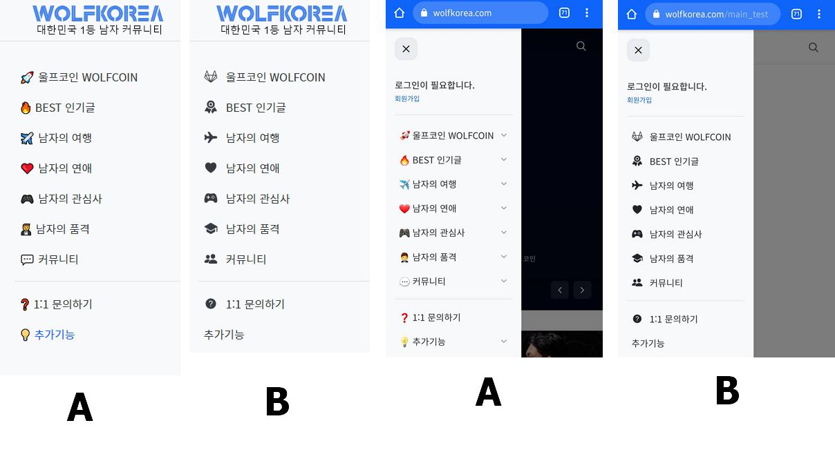
왼쪽은 PC버젼이고 오른쪽은 모바일 버젼이야.
댓글 50
댓글 쓰기![profile image](/files/member_extra_info/profile_image/300/132/132300.png?t=1615048750)
![profile image](/files/member_extra_info/profile_image/004/4.jpg?t=1716465231)
컬러풀한 색상과 아이콘이 사이트 디자인을 유치하게 만든다는 지적이 있어서 눈물을 머금고 변경하게 되었어.
비가 뭔가 더 간지나
그래서 정답은뭔뎅???
![profile image](/files/member_extra_info/profile_image/004/4.jpg?t=1716465231)
응응 B로 확정하고 적용완료~
세상간지나👍
![profile image](/files/member_extra_info/profile_image/798/232/232798.jpg?t=1679843962)
저는 b버전에서 a처럼 컬러가 됫음좋겠어요~
![profile image](/files/member_extra_info/profile_image/004/4.jpg?t=1716465231)
메뉴를 개별로 색상을 넣을 수가 없어. 물론 하드코딩을 하면 되긴 하지만 메뉴를 그렇게까지 처리하긴 좀 애매해서.
![profile image](/files/member_extra_info/profile_image/524/328/328524.gif?t=1618056671)
b가 울코랑 이미지가 더 잘 맞는듯 남성다움? ㅋ
![profile image](/files/member_extra_info/profile_image/004/4.jpg?t=1716465231)
응응 일단은 B로 적용했어.
![profile image](/files/member_extra_info/profile_image/040/012/12040.jpg?t=1600777453)
b가 절제되고 세련된 느낌이야 a는 화려하고 활기한 느낌
둘다 좋은데 선택하자면 b
![profile image](/files/member_extra_info/profile_image/004/4.jpg?t=1716465231)
![profile image](/files/member_extra_info/profile_image/525/118/118525.jpg?t=1693654835)
난 갠적으로 비가더좋으네 심플하고
전체적으로 넘 화려하지는 않았음해 촌스럽지도 않게
쉽지않겠지만 하나하나 수정하면 더 좋아지겠지
![profile image](/files/member_extra_info/profile_image/004/4.jpg?t=1716465231)
일단 기존 디자인이 너무 정신없고 촌스럽다는 지적이 있어서 수정하게 되었어.
의견 고마워.
![profile image](/files/member_extra_info/profile_image/004/4.jpg?t=1716465231)
브로들 댓글 고마워. 좀 더 의견 들어볼게.
모바일 버전에도 칼라를 적용하면 더 좋을듯..
흑백은 싫어...ㅋㅋㅋ
![profile image](/files/member_extra_info/profile_image/004/4.jpg?t=1716465231)
![profile image](/files/member_extra_info/profile_image/631/019/19631.jpg?t=1614092148)
칼라도 좋은데 울프코인 디자인이 블랙이 이쁨!!
블랙버전에 칼라를 넣으면!?
![profile image](/files/member_extra_info/profile_image/004/4.jpg?t=1716465231)
일단 활성화 된 게시판은 색상을 넣는 걸로 마무리했어. 메뉴에 색상이 담기면 호불호가 너무 갈리는거 같아.
![profile image](/files/member_extra_info/profile_image/381/118/118381.gif?t=1615687710)
B 블랙은 항상 옳지 무난 폭스코리아라면 A
![profile image](/files/member_extra_info/profile_image/004/4.jpg?t=1716465231)
울프코리아라서 B로 최종결정
![profile image](/files/member_extra_info/profile_image/882/405/405882.png?t=1617853234)
B 가 좋네
이모티콘에 색이 있으면 좋겠어 브로
![profile image](/files/member_extra_info/profile_image/004/4.jpg?t=1716465231)
의견 고마워. 이모티콘에 개별 색상을 넣는건 코드가 너무 복잡해져서 일단은 보류
![profile image](/files/member_extra_info/profile_image/774/138/138774.png?t=1679914958)
남성미있게 흑백이모티콘 좋은거같은데?
![profile image](/files/member_extra_info/profile_image/004/4.jpg?t=1716465231)
응! 블랙 이모티콘 적용. 디자인이 좀 더 세련된 느낌.
난 기존이 좋은것같아 브로
![profile image](/files/member_extra_info/profile_image/004/4.jpg?t=1716465231)
ㅠ_ㅠ 기존걸 반대하는 사람들이 너무 많아서 아쉽게도
![profile image](/files/member_extra_info/profile_image/739/132/132739.jpg?t=1620471553)
난 컬러풀한게 좋은데??
![profile image](/files/member_extra_info/profile_image/004/4.jpg?t=1716465231)
디자인이 구리고 B급감성이 느껴진다고 해서 슬프지만 ㅠ_ㅠ
난 b 깔끔한게 좋음 ㅎㅎㅎ
깔끔하니 있어보이넹
![profile image](/files/member_extra_info/profile_image/004/4.jpg?t=1716465231)
응응 컬러풀하진 않지만 무게감 있고 B가 남자커뮤랑 더 잘 어울리는 거 같아.
![profile image](/files/member_extra_info/profile_image/413/327/327413.jpg?t=1617632341)
저도 b더 잘어울린다고 생각해요.
![profile image](/files/member_extra_info/profile_image/004/4.jpg?t=1716465231)
![profile image](/files/member_extra_info/profile_image/934/119/119934.png?t=1615479604)
새로운 마크가 울프코인의 심볼이 되려나...?
![profile image](/files/member_extra_info/profile_image/004/4.jpg?t=1716465231)
여러가지 준비중이야. 하나씩 하나씩 공개할게.
![profile image](/files/member_extra_info/profile_image/934/119/119934.png?t=1615479604)
![profile image](/files/member_extra_info/profile_image/004/4.jpg?t=1716465231)
일단 의미는 없는거 같지만
as is 보다 to be가 더 깔끔하고 괞찬아.
선택 메뉴가 파랗게 변하는것도 좋고
일단 가독성이 좋아진거 같다.
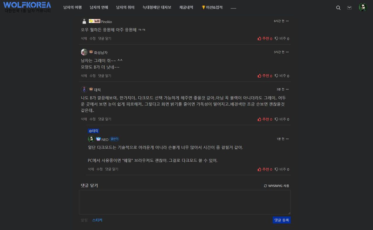
오우 여기 능력자 브로님들 왤케 많아? ㅋㅋ
오우 뭘하든 응원해 아주 응원해 ㅋㅋ
![profile image](/files/member_extra_info/profile_image/524/396/396524.jpg?t=1617889321)
남자는 그레이 쥐~~ ^^
모양도 B가 더 낫네~~
![profile image](/files/member_extra_info/profile_image/658/115/115658.png?t=1614872454)
나도 B가 깔끔해보여.. 한가지더.. 다크모드 선택 가능하게 해주면 좋을것 같아..아님 꼭 블랙이 아니더라도 그레이.. 어두운 곳에서 보면 눈이 쉽게 피로해져.. 그렇다고 화면 밝기를 줄이면 가독성이 떨어지고..배경색만 조금 손보면 괜찮을것 같은데..
![profile image](/files/member_extra_info/profile_image/004/4.jpg?t=1716465231)
일단 다크모드는 기술적으로 어려운게 아니라 손볼게 너무 많아서 시간이 좀 걸릴거 같아.
PC에서 사용중이면 "웨일" 브라우져도 괜찮아. 그걸로 다크모드 쓸 수 있어.
![profile image](/files/member_extra_info/profile_image/004/4.jpg?t=1716465231)
네이버 "웨일" 브라우져로는 이렇게 가능해.
![profile image](/files/member_extra_info/profile_image/658/115/115658.png?t=1614872454)
나는 모바일만 사용을 하거든..급한건 아니니까 시간되면 반영 부탁해~
![profile image](/files/member_extra_info/profile_image/004/4.jpg?t=1716465231)
지금 아예 신규 디자인이 준비되어 있긴해 다크모도 포함된 디자인. 상장 전후로 하루 날 잡고 업데이트를 한번 할게. 기대해도 좋아
![profile image](/files/member_extra_info/profile_image/658/115/115658.png?t=1614872454)
오~ 벌써 기대된다.. 얼마나 기다려야 하나 묻고 싶지만 상장 일정과 관계된 민감한 질문있것 같아서... 그냥 부푼마음으로 기다릴께~ 일요일인데도 열일하는 네오 브로.... 화이팅!!
![profile image](/files/member_extra_info/profile_image/004/4.jpg?t=1716465231)
![profile image](/files/member_extra_info/profile_image/335/450/450335.png?t=1673681639)
나도 b에 한표~
![profile image](/files/member_extra_info/profile_image/341/386/386341.jpg?t=1619071329)
B가 더 울프답지!
![profile image](/files/member_extra_info/profile_image/923/226/226923.jpg?t=1628897904)
B가 조아브로 ~~
음.. 난 컬러가 더 좋은데~~이모티콘은 변경이 나은데 검정색 말구 컬러입히면 더 나을듯 한데...내 생각에는..